Commons:Featured picture candidates/File:Стара фортеця.jpg
Jump to navigation
Jump to search
File:Стара фортеця.jpg, featured
[edit]Voting period is over. Please don't add any new votes.Voting period ends on 12 Nov 2012 at 18:18:38 (UTC)
Visit the nomination page to add or modify image notes.
 Info created by RBohdan - uploaded by RBohdan - nominated by Lystopad -- Lystopad (talk) 18:18, 3 November 2012 (UTC)
 Support -- Lystopad (talk) 18:18, 3 November 2012 (UTC)
- weak
 Support - I like it, even if the ghosts are a bit disturbing Tomer T (talk) 19:03, 3 November 2012 (UTC)
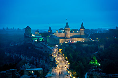
  Support As on QIC already. I find the blue hour atmosphere impressive, the image has good technical qualities. What we see on the bridge aren't ghosts, it's a motion blur (doesn't bother me, and not surprising with 13/1 s exposure). - A.Savin 20:38, 3 November 2012 (UTC)
 Comment -- Don't really agree with the motion blur of the moving people. They become far too distracting from the castle - especially since the foot-path is there to lead the eye to the castle, but my eyes become too fixated on them instead. -- Fotoriety
- Excuse me, but I really think that proverb "better to do you well, than to say well" works everywhere. Were is your contirbution to Commons? (There is no need to answer me) --Alex Florstein (talk) 08:06, 4 November 2012 (UTC)
- "Seek and you will find", Mt 7-7.--Jebulon (talk) 13:41, 6 November 2012 (UTC)
- Excuse me, but I really think that proverb "better to do you well, than to say well" works everywhere. Were is your contirbution to Commons? (There is no need to answer me) --Alex Florstein (talk) 08:06, 4 November 2012 (UTC)
- We are on this page to critique images, not to critique individuals. Please stay relevant.Fotoriety (talk) 09:14, 4 November 2012 (UTC)
- In this case I agree with Fotoriety, and will add that the image needs cropping in the foreground, up to the lamp on bottom right... that will take out a lot of the motion blurr and distracting elements, like the man on all fours at bottom left. The image is nice, but... --Tomascastelazo (talk) 17:09, 4 November 2012 (UTC)
- We are on this page to critique images, not to critique individuals. Please stay relevant.Fotoriety (talk) 09:14, 4 November 2012 (UTC)
 Support --Alex Florstein (talk) 08:06, 4 November 2012 (UTC)
 Support --Ivar (talk) 16:32, 5 November 2012 (UTC)
 Support nice mood --sfu (talk) 20:40, 5 November 2012 (UTC)
 Support Kruusamägi (talk) 21:18, 5 November 2012 (UTC)
 Oppose (weak) Per Tomascatelazo.--Jebulon (talk) 13:41, 6 November 2012 (UTC)
 Support very nice mood, the crop is good IMO --Wladyslaw (talk) 20:31, 6 November 2012 (UTC)
 Support - I like the mood and actually finds that the motion blur of the people adds to it. If anything the light next to the man on all fours (lower left) should be dampened, because they are a bit of a distraction, but not that much. --heb [T C E] 13:50, 7 November 2012 (UTC)
 Support -- VolodymyrF 13:04, 8 November 2012 (UTC)
 Support --Stas1995 (talk) 23:16, 10 November 2012 (UTC)
Confirmed results:
This image will be added to the FP gallery: Places/Architecture
