Commons:Featured picture candidates/File:VitoshaPlateau-1.jpg
Jump to navigation
Jump to search
File:VitoshaPlateau-1.jpg, not featured
[edit]Voting period is over. Please don't add any new votes.Voting period ends on 1 Dec 2010 at 17:17:20 (UTC)
Visit the nomination page to add or modify image notes.
 Info created, uploaded and nominated by MrPanyGoff -- MrPanyGoff (talk) 17:17, 22 November 2010 (UTC)
 Support -- MrPanyGoff (talk) 17:17, 22 November 2010 (UTC)
 Support --The High Fin Sperm Whale 17:41, 22 November 2010 (UTC)
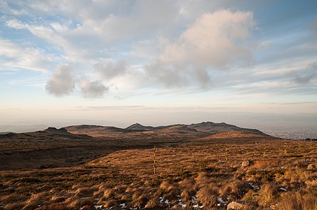
 Support Lighting conditions are great! --Murdockcrc (talk) 06:42, 23 November 2010 (UTC)
 Oppose - Teknik açıdan başarısız. Mulazimoglu (talk) 07:15, 23 November 2010 (UTC)
 Support --George Chernilevsky talk 08:00, 24 November 2010 (UTC)
 Oppose Nice clouds, but the foreground is unexciting, and the peaks are too much in shadow. --Avenue (talk) 08:35, 25 November 2010 (UTC)
 Oppose A bit too much shadow. I'm not enamoured with the clouds, so seeing 2/3 of the picture dominated by them doesn't inspire me. Nice lighting and texture on the ground. --99of9 (talk) 22:51, 25 November 2010 (UTC)
 Oppose plateau better shows pointing more down. More vertical more flat. Tanakashi (talk)
 Support It gives what a promises - A picture of a field. I think the real problem is maybe they'd like some green from spring, but it's currently autumn.. =\ Support. --IdLoveOne (talk) 22:24, 27 November 2010 (UTC)
 Oppose Interesting place, colors and light, but I find the yellow-black poles distracting. --Slaunger (talk) 13:39, 30 November 2010 (UTC)
Confirmed results:
Result: 5 support, 4 oppose, 0 neutral → not featured. /George Chernilevsky talk 20:04, 1 December 2010 (UTC)
