Commons:Featured picture candidates/Image:Julia set (C = 0.285, 0.01).jpg
Jump to navigation
Jump to search
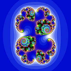
Image:Julia set (C = 0.285, 0.01).jpg -> featured
[edit]This is not just a image from the Julia set. It is a rather good image from the set. I'm using 3x3 super-sampling and a huge colour-palette to make them better than average fractal tools does.
- Nominate and support // Solkoll 22:06, 11 Apr 2005 (UTC)
- Support David.Monniaux 08:02, 12 Apr 2005 (UTC)
- Oppose norro 10:57, 12 Apr 2005 (UTC)
- Support, unusual choice for featured picture, Thuresson 14:14, 12 Apr 2005 (UTC)
Oppose- There are other nicer fractals ... -- Fabien1309 19:45, 13 Apr 2005 (UTC)
edit : Support for the blue one -- Fabien1309 12:31, 22 Apr 2005 (UTC)- Neutral I really like the idea to provide fractal images and even of there would be "nicer" fractals I regard it as a good image of the Julia set. The reasons for neutral are: I'm missing a detailed description about the program which was used to create it, the exact parameters and moreover a larger image with higher resolution would be better. Just give your box a little bit more time and use even lower discretization steps. Andreas Tille 15:25, 16 Apr 2005 (UTC)
- I can make a larger one, (is 1280x1280 good enough?) using 5x5 sampling but not the same palette I'm afraid, (I use random for these). I make all my pictures max 800x600 because that is the standard maximum size for images else they will be scaled, (if you do not change your preferences and only the pedia-pros does that). For a descrition of the program: Try to read this page, =) I may translate it to English later but it is a bit to do. I write a shorter descrition at the image page later, tomorrow or so, have not got the time right now. //Solkoll 21:03, 16 Apr 2005 (UTC)
A lot bigger version 2048x2048, diffrent palette used. My program generates these from random and there is no function there to save it to disk, (I may fix it sometime :). // Solkoll 22:48, 17 Apr 2005 (UTC)
- Support - for the blue one. Andreas Tille 15:04, 19 Apr 2005 (UTC)
- Opppose agree with Fabien1309. I don't like the random colors. norro 20:24, 20 Apr 2005 (UTC)
- Remark: Using these (not really random) colors seems quite typical in this field so it is no argument in my eyes. Andreas Tille 06:36, 22 Apr 2005 (UTC)

