Commons:Featured picture candidates/Image:Sagami Temple 2600px.jpg
Jump to navigation
Jump to search
Image:Sagami Temple 2600px.jpg, featured
[edit] Info created by 663highland - uploaded and nominated by Laitche --Laitche 12:09, 2 December 2007 (UTC)
 Support --Laitche 12:09, 2 December 2007 (UTC)
 Support -- Cpl Syx 19:18, 2 December 2007 (UTC)
 Support --Böhringer 21:44, 2 December 2007 (UTC)
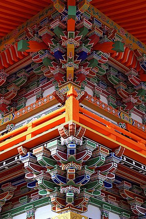
 Neutral -- Beautiful colours, but i think a shot of the whole roof temple might have been more interesting -
  Husky (talk to me) 22:42, 2 December 2007 (UTC)
 Neutral Thats a very nice photo with delicate colurs and sharpness. As an observer my eye is immediately drawn to it. One thing though. I would have liked to see how it ended at the roof. One can see how the pattern ends below, but not above. -- Slaunger 23:17, 2 December 2007 (UTC)
- You can see how it ended at the roof. Here you are. :) --Laitche 10:36, 3 December 2007 (UTC)
- Well, thank you. However, I do not think it should be necessary to look at supplementary photos when evaluating an FPC to get the full picture;-) - Slaunger 07:11, 6 December 2007 (UTC).
- You can see how it ended at the roof. Here you are. :) --Laitche 10:36, 3 December 2007 (UTC)
 Support I would also have liked to see the photo continue above, but the overall effect is still dazzling (so many colors and details and angles to look at). Arria Belli | parlami 23:56, 2 December 2007 (UTC)
 Neutral Great colors but it appears tilted clockwise to me. Dori - Talk 01:28, 3 December 2007 (UTC)
- I think that the photograph is not tilted. Some pillars are tilted clockwise a little. Please see this one. --Laitche 14:11, 3 December 2007 (UTC)
 Support --Thermos 16:19, 3 December 2007 (UTC)
 Oppose Sorry to go against the flow but the lighting bothers me (glarey in the middle and gloomy at the top), as well as the loss of the very top of the design. --MichaelMaggs 19:01, 3 December 2007 (UTC)
 Support Poromiami 20:26, 3 December 2007 (UTC)
 Support -- Acarpentier 16:38, 4 December 2007 (UTC)
 Support Obviously nice colors, and the centered look works with the geometric shapes, rather than against it like many other pictures. -- Ram-Man 22:59, 5 December 2007 (UTC)
 Support --LucaG 20:10, 6 December 2007 (UTC)
 Support Too tightly cropped at the top, but nevertheless FP quality. -- MJJR 21:52, 6 December 2007 (UTC)
 Support Benh 09:02, 8 December 2007 (UTC)
 Support Beautiful shot. Interesting symmetry, lively, clean color and good shadow detail. Well done.--Wrspiers 06:01, 11 December 2007 (UTC)
result: 12 Support, 1 Oppose, 3 Neutral => featured. Simonizer 09:37, 12 December 2007 (UTC)
