Commons:Featured picture candidates/Image:Schloss Nymphenburg Munich.jpg
Jump to navigation
Jump to search
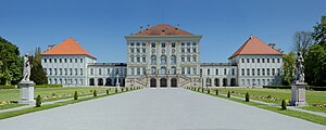
Image:Schloss Nymphenburg Munich.jpg - not featured
[edit]
 Info created , uploaded & nominated by --Richard Bartz 17:07, 8 May 2008 (UTC)
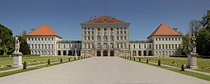
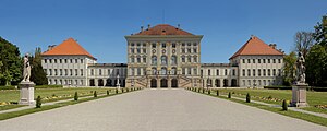
 InfoThe Nymphenburg Palace (German: Schloss Nymphenburg) is a Baroque palace in Munich, Bavaria, Germany. The palace was the summer residence of the rulers of Bavaria.
 Support --Richard Bartz 17:07, 8 May 2008 (UTC)
 Support--Mbz1
 Support Is it real ? --B.navez 18:46, 8 May 2008 (UTC)
 Support Nice.(^^)/ -- Laitche 18:54, 8 May 2008 (UTC)
 Move Moved to the alternative(Edit 3). -- Laitche 07:26, 10 May 2008 (UTC)
 Oppose, cyan colour cast. --Aqwis 20:55, 8 May 2008 (UTC)
result: 2 support, 1 oppose >> not featured -- Alvesgaspar 09:04, 18 May 2008 (UTC)
Edit 1 (centre) featured
[edit] Info With color correction as i was in a different color space
 Support --Richard Bartz 21:12, 8 May 2008 (UTC)
 Support Even better.--Mbz1 21:18, 8 May 2008 (UTC)
Support, better. --Aqwis 21:48, 8 May 2008 (UTC) Support great --Simonizer 22:54, 8 May 2008 (UTC)
 Comment - Great quality but unbalanced composition with too much empty foreground. I would crop about 15% of it at the bottom -- Alvesgaspar 23:12, 8 May 2008 (UTC)
- There are wonderful statues in the foreground which i wanted 2 give enough space. Otherwise this park is part of the whole complex and the picture would get this typical pano stripe shape which i dont like, but feel free to do another edit. --Richard Bartz 23:52, 8 May 2008 (UTC)
 Support --Böhringer 06:04, 9 May 2008 (UTC)
 Support difficult decision btw cropped and uncropped ...but the argument by Richard that the statues need space somehow convinced me. Though I normally am a friend of tight crops. --AngMoKio 14:33, 9 May 2008 (UTC)
 Support Good, but could be a little better. The lighting is kinda flat a little bit of Curves would do nicely on the highlights. Plus the colors are kinda dull, I discovered a new method of increasing the saturation without screwing up the luminosity that I'm willing to share. Switch to LAB color, then increase the contrast (works best in CS3) for the A and B channels and switch back to RGB. Viola, increased saturation without all the problems of the Hue/Saturation adjustment. --Calibas 02:32, 10 May 2008 (UTC)
 Support --Thermos 08:12, 10 May 2008 (UTC)
 Support -- Laitche 10:11, 12 May 2008 (UTC)
 Support Excellent work Freedom to share 15:52, 14 May 2008 (UTC)
 Comment Nice work, indeed. But wow is missing. 71.135.33.48 03:17, 15 May 2008 (UTC)
result: 8 support, 0 oppose >> featured -- Alvesgaspar 09:04, 18 May 2008 (UTC)
Edit 2 (right) - not featured
[edit] Info Here is what I mean -- Alvesgaspar 08:29, 9 May 2008 (UTC)
 Support Alvesgaspar 08:29, 9 May 2008 (UTC)
Support, you're right. --Aqwis 12:08, 9 May 2008 (UTC) Comment A tighter crop by Alvesgaspar! ...alone this deserves a support ;-) --AngMoKio 14:33, 9 May 2008 (UTC)
 Alvesgaspar 08:03, 13 May 2008 (UTC)
result: Withdrawn >> not featured -- Alvesgaspar 08:03, 13 May 2008 (UTC)
Edit 3 (alternative) - not featured
[edit] Info created by Richard Bartz, nominated by Laitche -- Laitche 07:22, 10 May 2008 (UTC)
 Support -- Laitche 07:22, 10 May 2008 (UTC)
 Support, waiting for the next edit :p. --Aqwis 12:25, 10 May 2008 (UTC)
 Thanks. -- Laitche 10:11, 12 May 2008 (UTC)
result: Withdrawn >> not featured -- Alvesgaspar 08:03, 13 May 2008 (UTC)


