Commons:Valued image candidates/Scène des massacres de Scio.jpg
Scène des massacres de Scio.jpg
| Image |  |
|---|---|
| Nominated by | Wilfredor (talk) on 2024-07-31 18:51 (UTC) |
| Scope | Nominated as the most valued image on Commons within the scope: Scène des massacres de Scio, Louvre room 700 |
| Used in | Global usage |
| Reason | best in scope -- Wilfredor (talk) |
| Review (criteria) |
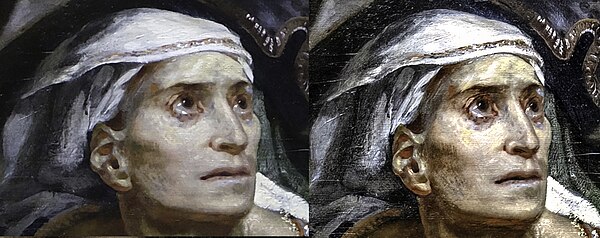
 I wanted to put this comparison side by side so you can see that the one on the left, your proposal, looks cleaner and smoother with softer colors due to the noise removal and coloring algorithm of the camera, while the one on the right shows stronger colors and more textures in the upper part of the painting, as you see more details you also see more imperfections in the canvas but it is also somewhat more real. --Wilfredor (talk) 23:13, 7 August 2024 (UTC)  Another comparison. Yes It's a question of taste. On the right we can see the canvas and a lit bit more details but there is more noise. The colors should not be too strong, because there are not like that in the painting and plus it can be an issue for other uses. On the left we can see the Delacroix's soft tones that the restoration has reveleaded, and the subtil red of the lips. By the way, the 2 images could be improved: the one on left needs more unsharp mask (done for this detail), and for the one on right, the ratio width/height was not corrected after perspective correction (the width is too small or the height too large, cf.: https://collections.louvre.fr/ark:/53355/cl010065870 ) Thanks for the exploration in the images and therefore in the painting. Best regards --Shonagon (talk) 01:40, 8 August 2024 (UTC)
Result: 1 support, 1 oppose =>
undecided. Archaeodontosaurus (talk) 05:04, 10 August 2024 (UTC) |