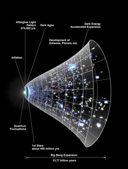
File talk:CMB Timeline300 no WMAP.jpg
Missleading in subtle but fundamental ways
[edit]Unfortunately, this image is missleading in subtle but fundamental ways:
- rays of light to the left imply that there was something before and/or "outside" the universe.
- in the image inflation spans most of the time until the universe got transparent at the age of 380 000 years. In reality inflation ceased at about 1e-32 s. The relative size of difference is a whooping 44 orders of magnitude.
- linear expansion is by far the most dominant mode of evolution of the universe ever since inflation ended. The image makes this aspect hardly visible at all.
- compared to the linear expansion, accelerated expansion is grossly overrepresented. In the image it contributes about half of the present rate of expansion. In reality, accelerated expansion is very small compared to linear expansion. It has only fairly recently been detected at all.
- the scope of what is shown inside the tube varies by very many orders of magnitude. At the very left it shows the cosmic microwave background of the whole universe. At the right a few galaxies hardly shows our local galactic group. The image falsely suggests that the former evoved into the later.
- the evenly spaced circumferential lines suggest a linear progression of time from left to right. The opposite is true. The timescale cannot even be logarithmic to match the time distance of events shown inside the tube.
- the image suggests that space was densly populated in the early universe and the presently seen voids of emptyness would open only slowly over myriads of years. The opposite is true. The very granular arrangement of matter was already present in the dark ages.
As beautiful as the image is, it needs to be enjoyed with rather large grains of salt. ---<(kmk)>- (talk) 19:04, 18 February 2015 (UTC)
- Although I agree with this analysis, I am particularly concerned with the misrepresentation of the inflationary vs non-inflationary expansion epochs. See section 'Graphical representation of the expansion of the universe' below - Richardbrucebaxter (talk) 17:42, 8 June 2019 (UTC)
Graphical representation of the expansion of the universe
[edit](Extract from Wikipedia: Talk:Expansion of the universe / File talk:CMB Timeline300 no WMAP.jpg)

File:CMB Timeline300 no WMAP.jpg is a really misleading graphic and it has been inadvertently copied all over the internet (as of 2019). It should only ever be used in the context of explaining theoretical inflation (and I wouldn't recommend using this graphic in that context either - unless one was attempting to make a specific point about the intensity of inflationary expansion). The theoretical inflationary epoch is believed to have expanded the observable universe only up unto approximately 10-100cm^3, nothing like what is shown in the graphic (ie size of current observable universe/2). Furthermore, it is difficult to observe the approximate constant expansion of the universe in the graphic (what the graphic is typically used to demonstrate) due to;
- a) its apparent (but misleading) insignificance compared to inflationary expansion,
- b) the fact it is not uniformly expanding in the positive and negative direction of the y axis (it is nearly flat at the high end of the y axis), and;
- c) the fact the constant expansion only results in the observable universe increasing approximately 2x in size since the end of inflation (it really should be something like x10^(15+9+2=26)=x100000000000000000000000000, and so its proper visualisation requires a minimum expansion of 10x.
Note to demonstrate the concept of constant expansion (Hubble's constant), I recommend linking to a 3D simulation such as; "Simulation of the Big Bang and expanding universe" (https://www.youtube.com/watch?v=WGUBt-vNFC8).
I have created a modified version of the graphic below;
